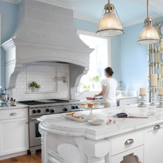
Since we couldn't do much without the inspiration of other photos, here are a few that captured our eyes:
We like this one for the darker floors and the use of bright white without seeming to be colorless. Also a big fan of islands that look like converted furniture.
This is a great shot for a few reasons: 1) You can see the gray backsplash, which creates more color in the room. Funny how even gray can do that on a white palette. 2) I love how the pots are hanging in clear view. Hawk and I purchased a hanging pot-rack; it's the number one object for which we receive compliments. Now that I have one, I can't imagine ever drawing my pots/pans from a shelf (or a pile). It's so easy and it protects them. 3) BASKETS!!!! If you remember the inspiration image from a few weeks back, you'll note baskets. Whoever brought these back into the kitchen is brilliant. They are decorative, versatile, and they shake up what could be too much cabinet-cover facade. I personally like them because I'm short. We've placed 8 baskets (on sale at Crate & Barrel from $16.95 to 9.95 a piece!) in our upper kitchen shelves. Since I can pretty much just reach the front of each shelf, this makes it possible for us to utilize the full shelf. Otherwise, I'd be constantly asking Hawk to come in and "just reach that thingie for me."
Another fantastic shot! Or maybe just a good shot of a fantastic kitchen.
All of the above images came from the Better By Design magazine, found off the HGTV website.
I found the following images off the HGTV site as well. Now, I don't like to be negative, but I think this is a good example of a quality kitchen remodel that went for the white look but missed something important:
It's just a bit too sterile. Even with the few color items added, the room itself is overrun by that dark gray countertop.
Though it's much larger than anything we would do now or in the future (cottage style doesn't allow for the "go big or go home" motto), here's another quality remodel with fantastic hanging lamps! I can appreciate this space for its detail, funky curtains, and joyful color.
And then two of my favorites again. The first seems so light and comfortable without sacrificing function. I could easily start the habit of drinking my morning tar in this chair, never leaving the kitchen at all...
I also like how their accessories compliment their overall color scheme. Haha, isn't it funny that a kitchen can have accessories?
And though it is again too large for our style, we love this room for the clock, the large range area, the original lamps, and the dark dark dark floor:
{devote} One thing we learned about going through photos together: Never, but never respond with, "Ew, that's hideous." This is very bad for the marriage. We discovered that these photos revealed two things: 1) this image is a piece of what I excites me elsewhere, and 2) this image reveals who I see us becoming as a family (this is the big one). Understanding that early on taught us a bit more about the other person beyond their sense of aesthetics.
That's all for today folks.
Kenley/Haiti update: Compassion can't get through to any of the families, so it looks like we won't know for a good week or more if he and his family are safe. In the meantime, its a good thing to keep praying about. NPR has been covering the aid needed and the aid already given.
icj,
~j


No comments:
Post a Comment
thishawksnest reserves the right to remove any comment not contributing to content and conversation.